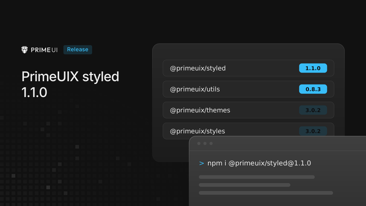
Four of the theming packages under PrimeVue, PrimeReact and PrimeNG have new versions:
npm install @primeuix/[email protected] @primeuix/[email protected] @primeuix/[email protected] @primeuix/[email protected]Four problems are fixed in them: a type error on a preset whose css is a
function, dark mode not applying inside a shadow root when darkModeSelector is
an attribute selector, token values that could break out of their declaration,
and a Lara token the browser could not parse.
These packages rarely need a direct install. PrimeVue 5.0.3, PrimeReact 11.2.1 and PrimeNG 22.1.3 require them, and the earlier 5.0.x, 11.x and 22.x versions accept them, so a fresh install of any of those already picks them up.
For an app that changes nothing in its setup, the generated CSS is the same as before, apart from the fixes below. The output of the new version was compared with the published one for every preset and the common theme options (dark mode selectors, prefix, scoped, CSS layers, CSS variables off), and the published products were compared before and after the update.
Typing a function as preset css
A preset that compiled before @primeuix/themes 3.0 can fail with this error on
3.0.0 and 3.0.1
(discussion #4861):
TS2322: Type ({dt}: { dt: any; }) => string is not assignable to type ExtendedCSSThe css of a preset, and of a component inside it, can be a string or a
function that receives dt. In 3.0.0 and 3.0.1 the function form was typed with
an optional parameter, (options?: StyleOptions) => string, so under strict a
function that reads dt from its parameter did not compile: reading { dt }
from a possibly undefined parameter gave TS2339, and annotating the parameter
gave the TS2322 above. In 3.0.2 the parameter is required, and both forms
compile:
import { definePreset, palette } from '@primeuix/themes';
import Aura from '@primeuix/themes/aura';

export const MyPreset = definePreset(Aura, {
    semantic: {
        primary: palette('#ff8400')
    },
    components: {
        drawer: {
            css: ({ dt }) => `.p-drawer { border-color: ${dt('primary.color')}; }`
        }
    },
    css: ({ dt }) => `body { accent-color: ${dt('primary.color')}; }`
});
dt needs no annotation, since the type comes from definePreset. Written out,
the type is StyleOptions from @primeuix/styled:
import type { StyleOptions } from '@primeuix/styled';

const css = ({ dt }: StyleOptions) => `body { accent-color: ${dt('primary.color')}; }`;
Annotating it as { dt: string } is still an error: dt is a function that
returns a CSS value.
A related error is secondary no longer being accepted under semantic. That
part is not fixed in 3.0.2. A custom palette under semantic works at runtime,
but the published preset types only list the semantic tokens the presets define,
so secondary fails type checking with TS2353. Until that changes, put custom
tokens under extend. It produces the same variables and the same dt
references, and it type checks:
export const MyPreset = definePreset(Aura, {
    semantic: {
        primary: palette('#ff8400')
    },
    extend: {
        secondary: palette('#11484f')
    }
});

// --p-secondary-500 is defined, and dt('secondary.500') is var(--p-secondary-500)
An attribute dark mode selector
With an attribute selector such as darkModeSelector: '[data-theme="dark"]',
the theme wrote its shadow root rule as :host[data-theme="dark"]. That
selector cannot match, so components inside a shadow root ignored dark mode. It
is now :host([data-theme="dark"]).
The same option had a second problem with the dt prop. A dark override on one
component was written with a selector list that also contained a bare
:root[data-theme="dark"]:
/* 1.0.0 */
:root[data-theme='dark'],
:host[data-theme='dark'][pc1],
:root[data-theme='dark'],
:host[data-theme='dark'] [pc1] {
    --p-button-background: #000;
}

/* 1.1.0 */
[data-theme='dark'][pc1],
:root[data-theme='dark'] [pc1],
:host([data-theme='dark']) [pc1] {
    --p-button-background: #000;
}
In dark mode the old rule set the variable on the page root, so a dt override
on one Button changed every Button. In 1.1.0 it is limited to the component that
has the prop. Class selectors such as .app-dark were not affected.
Unsafe token values
A token value is written into a CSS declaration as it is. A value that contains
;, } or an unclosed string could end that declaration and start a new rule:
definePreset(Aura, {
    semantic: { primary: { color: 'red; } body { display: none' } }
});
1.0.0 wrote body { display: none } into the page. 1.1.0 checks each value the
way the browser reads CSS and drops a value that would break out of its
declaration, so that token is left undefined instead. This matters most when
token values come from users, for example a theme editor built into a product.
Lara
The focus ring token of Lara’s secondary button was missing a parenthesis:
light-dark{surface.200}, ... where every other focus ring reads
light-dark({surface.200}, ...). The value is not valid CSS, so the browser
dropped the whole box-shadow declaration, and a focused secondary button had
no ring shadow. The token is written correctly in @primeuix/themes 3.0.2 and
later.
New in styled 1.1.0 and utils 0.8.3
The same releases add three features, which apps use through the libraries:
- Isolated mode gives an app its own theme, so several apps can share a page or
render in shadow roots. It comes as a new entry point,
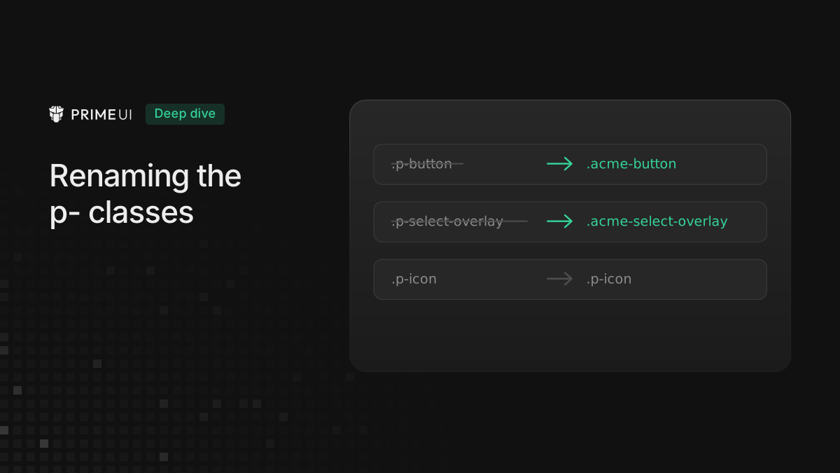
@primeuix/styled/isolation, and is experimental. Running two PrimeUI apps on one page covers how it works. classPrefixis a theme option that renames thep-component classes (Renaming the p- classes with classPrefix).@primeuix/utilshas two Shadow DOM helpers,getEventTargetand agetActiveElementthat looks into the right root. The libraries call them for outside clicks and focus checks inside shadow roots, and Using PrimeUI components inside a shadow root has the details.
Upgrading
No setup has to change. Two of the fixes above change what shows on screen, and both are corrections:
- With an attribute
darkModeSelectoranddtprops, a dark override that used to repaint every instance of a component now applies only to the instance that has it. - With Lara, the secondary button’s focus ring shadow is applied again.