PrimeVue 5.0.4 is out with more Select fixes from the component audit. It also cuts re-renders in virtual scrolling and repeated style writes, and adds an optional reset for the native elements inside components.
npm install [email protected]preflight is off by default, so nothing changes until an app turns it on. A
renamed member of the SelectClasses enum can break a compile, and the
Upgrading section covers it.
Preflight
A component is built from native elements: a Select has a button and a ul, a
DataTable has a table, an InputText is an input. Browsers give those
elements margins, borders, fonts and list styling, and wherever the component
CSS does not override a default, it shows through. This shows only in apps that
do not load Tailwind’s preflight, normalize.css or a similar reset.
preflight resets those defaults, but only on elements a PrimeVue component
renders:
import { createApp } from 'vue';
import PrimeVue from 'primevue/config';
import App from './App.vue';

const app = createApp(App);

app.use(PrimeVue, { preflight: true });
In Nuxt it goes under the module’s options:
export default defineNuxtConfig({
    modules: ['@primevue/nuxt-module'],
    primevue: {
        options: {
            preflight: true
        }
    }
});
The option is experimental, and its behavior may still change based on feedback.
The reset comes from @primeuix/styles 3.1.0, and 5.0.4 requires that version.
Every rule matches an element marked with data-pc-section, so a button
elsewhere on the page keeps its browser defaults. Because every selector is
wrapped in :where(), a rule in the app that targets the same element wins
without !important. The rules sit in their own cascade layer, primeui.base,
and PrimeVue puts the layer order at the top of the head, before any other
style:
cssLayer | Layer order written |
|---|---|
| off | @layer primeui.base; |
true | @layer primeui.base,primeui; |
| a custom name and order | primeui.base first, then the given order |
With cssLayer off the component styles are not in a layer, and they win over
the reset. With it on, primeui.base is nested under primeui, and the
component styles in primeui still win. The reset is skipped in unstyled mode.
In isolated mode it is scoped to the isolated app, and
getIsolatedStyleSheets({ preflight: true }) includes it in the server output.
The Nuxt module writes it into the server response as well. The
PrimeUIX styled 1.2.0 post
explains why the order has to be written in a single statement.
An app that already loads its own reset can leave the option off.
Select
- Select stopped every Escape key press, so Escape on a Select with its list closed did not reach a Dialog around it. It now stops Escape only when it closes its own list.
- An icon from the
#cleariconslot cleared the value and then opened the list, because the click also reached the container. It now only clears. - A click on a loading Select did nothing, but ArrowDown still opened it. Select
and MultiSelect now ignore the keyboard as well while
loading. - Filtering only matched string options, so with
:options="[10, 20, 30]"typing2in the filter returned nothing. Any primitive value now matches on its own text, so the same filter returns20. The fix is inFilterService, which Select, MultiSelect and Listbox share. - When
optionLabelresolved tonullfor the selected option, rendering threw aTypeError. The label now renders empty. - Clicking the
<label for>of a disabled Select focused it, so the next blur marked the form field as touched. The click is ignored while disabled. - In multiple selection, picking an option with the mouse moved focus to the page, so the keyboard stopped working on the Select. Focus now stays on it.
- With the list closed,
aria-activedescendantcould point at an option that was not in the page. It is now set only while the list is open, in AutoComplete and MultiSelect as well. - Opening the list twice in quick succession left a timer that unmounting did not cancel. The pending timer is now cleared first.
- Calling the clear handler directly on a read-only Select still emptied the value. It now leaves a read-only value alone, as the clear icon already did.
- The key in
SelectStylewas spelledloadingicon, unlike the other keys. It is nowloadingIcon, and the rendered class is stillp-select-loading-icon.
Gallery
An item whose zoomedScale is not larger than its normalScale cannot zoom,
but it still captured the pointer and blocked text selection and dragging. A
video inside such an item did not respond to its own controls, and text in it
could not be selected.
Items that cannot zoom no longer bind the zoom gestures. They keep normal text
selection and touch behavior, Ctrl and the mouse wheel do not zoom them, and the
zoom buttons are disabled while one of those items is the active one. The item
root carries data-zoomable="false", and the zoom toggle exposes a disabled
slot prop.
Less work while rendering
Virtual scrolling in DataTable. Each row passed a fresh options object to every cell, and the scroller replaced its spacer style even when the size was the same. Both made Vue update rows that had not changed. With a 10-row window and two columns, shifting the window by two rows updated 8 rows and 16 cells, and recalculating the spacer at the same size updated 10 rows. Neither case updates any rows now. The spacer change also applies to VirtualScroller used on its own.
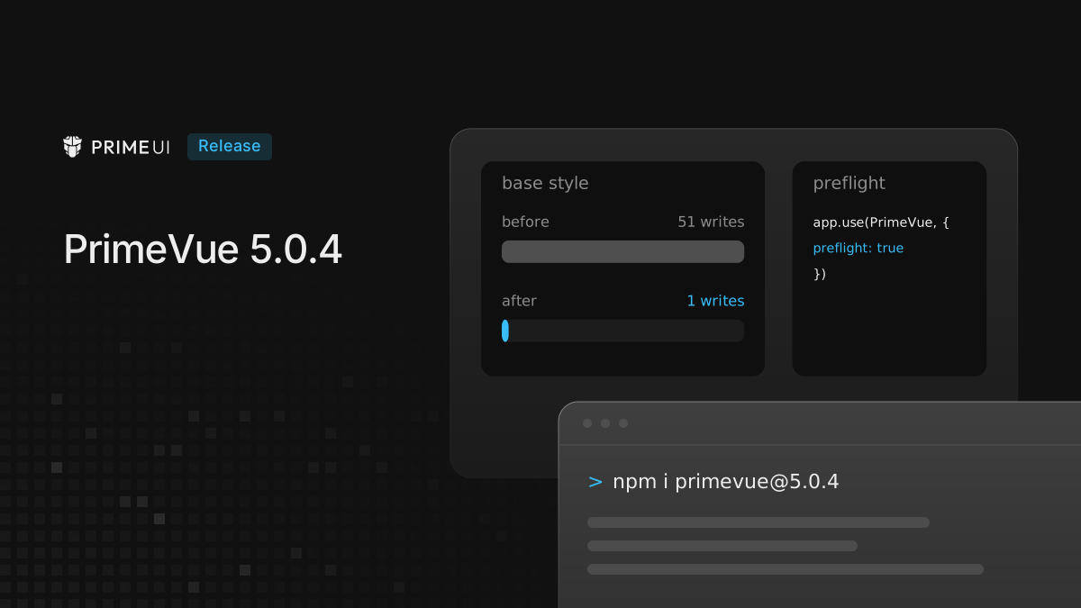
Shared style elements. Every component that mounted wrote the shared
<style> elements again, even when their text had not changed. With 50 Buttons
mounted together, the base style element was written 51 times. It is now written
once.
Directives inside Suspense. A directive on an element inside a pending
<Suspense> could register its theme change listener again after the element
was unmounted. The listener kept the element in memory, so detached nodes
accumulated as routes changed. A directive now skips that late registration for
an element that is already unmounted.
DatePicker
A day that cannot be picked, because of minDate, maxDate, disabledDates or
disabledDays, carried aria-disabled only on its inner span, not on the
grid cell a screen reader reads. The cell now carries aria-disabled="true".
Types
PrimeVueConfigurationimported fromprimevue/configwas missingisolation,shadowRootandlicense, so passing them failed to compile. It now extends the core configuration type and includes every option, among thempreflight.- The default exports of the style modules, such as
primevue/button/style, had no type. Passing them togetIsolatedStyleSheetsor calling their methods failed to compile. Every style module is now typed.
Upgrading
From any 5.0.x it is a version bump:
npm install [email protected]Two things to check afterwards:
- The
SelectClassesenum memberloadingiconis nowloadingIcon. Code that names the old member no longer compiles. An override that extendsSelectStylewith the keyloadingiconno longer replaces the class, so useloadingIcon. - In the Gallery types, the pointer and click handlers in
GalleryItemA11yAttrsare optional, because items that cannot zoom do not bind them.
The full list is in the changelog. The PrimeNG 22.1.4 and PrimeReact 11.2.2 posts cover the same preflight option in the other two libraries.